Bus Shelter : Portland, ME
Title: "We the People: Celebrating Diversity through Language and Script"
"We the People" is a captivating installation designed to honor and celebrate the diverse linguistic landscape of the Portland public schools. Consisting of vinyl panels and lenticular prints, this innovative piece of public art embraces the richness of cultural diversity by emphasizing various languages and scripts.
Date: August 2022
Description: In August 2022, the "We the People" bus shelter installation was unveiled, showcasing a vibrant tapestry of languages and scripts. With at least 63 languages spoken in the Portland public schools, the installation serves as a powerful symbol of inclusivity and unity.
Design Concept: The design concept of "We the People" revolves around the idea of embracing linguistic diversity. Each vinyl panel features excerpts from the Preamble to the United States Constitution in multiple languages, representing the voices of the diverse communities within Portland. The use of lenticular prints adds an interactive element to the installation, allowing viewers to see the text transform between different languages as they move around the shelter.
Purpose: By highlighting the various languages and scripts present in the Portland public schools, "We the People" aims to foster a sense of belonging and pride among students and community members from different cultural backgrounds. The installation serves as a visual reminder of the strength that comes from embracing diversity and the importance of inclusion in our society.
Impact: Since its installation, "We the People" has become a focal point for community engagement and dialogue. It has sparked conversations about the value of linguistic diversity and the role it plays in shaping our collective identity. The installation serves as a testament to Portland's commitment to celebrating its multicultural heritage and creating a welcoming environment for all residents.
In summary, "We the People" stands as a testament to the power of art to bridge cultural divides and promote understanding. Through its bold design and inclusive message, the installation serves as a beacon of hope and inspiration for the Portland community.
Jana : The Chromatic Kannada
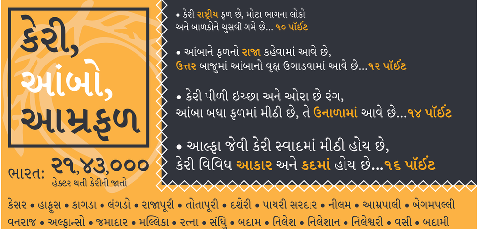
In the vibrant streets of Bangalore, India, a unique form of expression emerged – "Jana," the chromatic Kannada (A language spoken in the southern part of India). This amalgam of letterforms, born from the lively energy of street signage, aimed to infuse the Indian script with a new medium that had yet to embrace its chromatic potential fully. This proposal embarks on a colorful and favorable evolution of Jana, the chromatic wood/digital typeface, to enhance the rich intricacy of the script while advocating for its preservation and adaptation into modern typographic practices. The unique beauty of the chromatic Kannada woodtype is a testament to India's rich cultural heritage.
The proposed project will open the audience to the complicated structure of Indian scripts. It aims to persist in collecting impressions from the wood-type glyphs within different Chromatic settings of the layers. The complete character set of the Kannada script is more complicated than in English due to the presence of compound characters. However, this script does not represent upper/lower case characters. Modern Kannada has 51 base characters called Varnamale. There are 16 vowels and 35 consonants. A sum of 510 glyphs combined with 12 matras (a diacritic arrangement that gives sounds to the letter) showcases the stacking system of Indian script. These beautiful complications of styles enable one to understand the placement and registration of the Chromatic system.
The landscape of Indian typography and the advent of typecasting and printing technologies in the mid-19th to 20th century brought a resurgence. Metal and wood types flourished, adorning the pages of books and newspapers with their eloquent strokes. Concurrently, the art of hand-painted signs, meticulously crafted by local artisans, added a kaleidoscopic charm to the urban fabric, epitomizing the essence of India's chromatic allure.
However, as the digital age dawned, traditional sign painting faced an existential threat. The allure of digital production methods encroached upon the hand craftsmanship domain, imperiling this time-honored tradition's legacy.
This project stands at the confluence of tradition and innovation, seeking to honor the legacy of India's sign-painting tradition while pioneering a new frontier – the creation of the first chromatic Kannada typeface. By melding decorative conventions with India's calligraphic lineage, this endeavor aspires to breathe new life into the age-old art form, ensuring that the vibrant hues of "Jana" continue illuminating the streets for generations to come.
Through meticulous research, collaborative efforts, and a commitment to excellence, this project endeavors to carve a niche in the annals of typographic history. It is a testament to India's cultural heritage's resilience and enduring creativity.
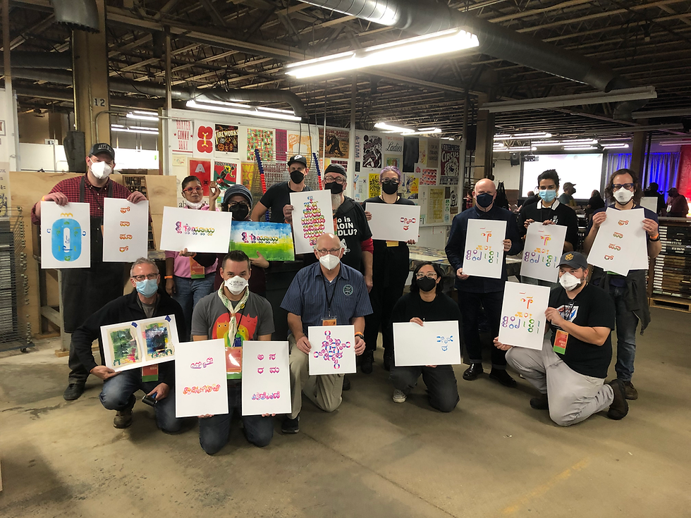
Images represent below are from The workshop conducted at Hamilton Wood Type Museum, Wisconsin, 2022
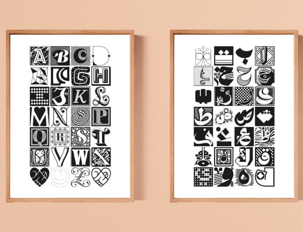
Collection of Adobe Type specimens commissioned to designed for various typeface in their library.
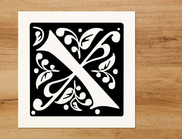
Tangles: Reviving the Elegance of Medieval Gravestone Lettering
Description: Tangles is a meticulously crafted typeface inspired by the exquisite lettering found on 14th to 16th-century gravestones from England and Europe. Rooted in the rich heritage of medieval calligraphy, this unique typeface embodies the elegance, intricacy, and ornamental beauty of its historical predecessors.
Design Concept: Drawing inspiration from the delicate flourishes, ornamental styles, and decorative elements adorning medieval gravestone lettering, Tangles captures the essence of a bygone era. Each letterform is meticulously crafted to evoke a sense of timeless elegance and sophistication, reminiscent of the craftsmanship that adorned the tombs of nobles and scholars centuries ago.
Purpose: Tangles serves as a tribute to the artistry and craftsmanship of medieval calligraphers, preserving their legacy for future generations. By reviving the aesthetics of gravestone lettering, the typeface offers designers and typographers a versatile tool for adding a touch of historical elegance to their projects, whether in print or digital media.
Key Features:
-
Intricate flourishes and decorative elements that add depth and dimension to each letterform.
-
Ornamental styles that evoke the ornate beauty of medieval calligraphy, lending a sense of sophistication to any design.
-
Versatility in usage, suitable for a wide range of applications including signage, branding, editorial design, and more.
Impact: Tangles aims to inspire creativity and appreciation for the art of calligraphy, while also serving as a valuable resource for designers seeking to incorporate historical elements into their work. By capturing the essence of medieval gravestone lettering in a modern typeface, Tangles bridges the gap between past and present, enriching contemporary design with a sense of timeless elegance.
In summary, Tangles is not just a typeface; it is a celebration of artistic heritage and a testament to the enduring beauty of medieval calligraphy. With its intricate details and ornamental flair, Tangles invites designers to embark on a journey through time, exploring the elegance and sophistication of a bygone era.